The Mortgage Stop

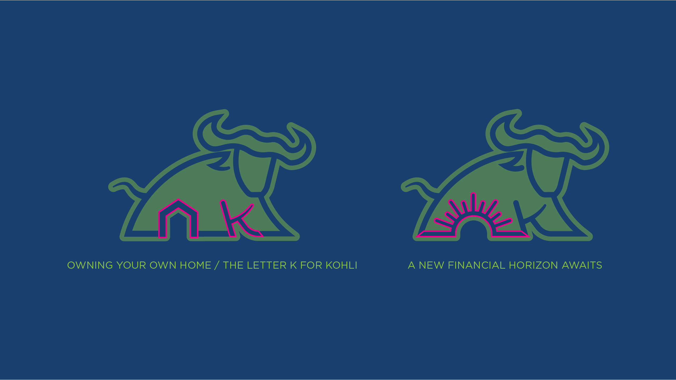
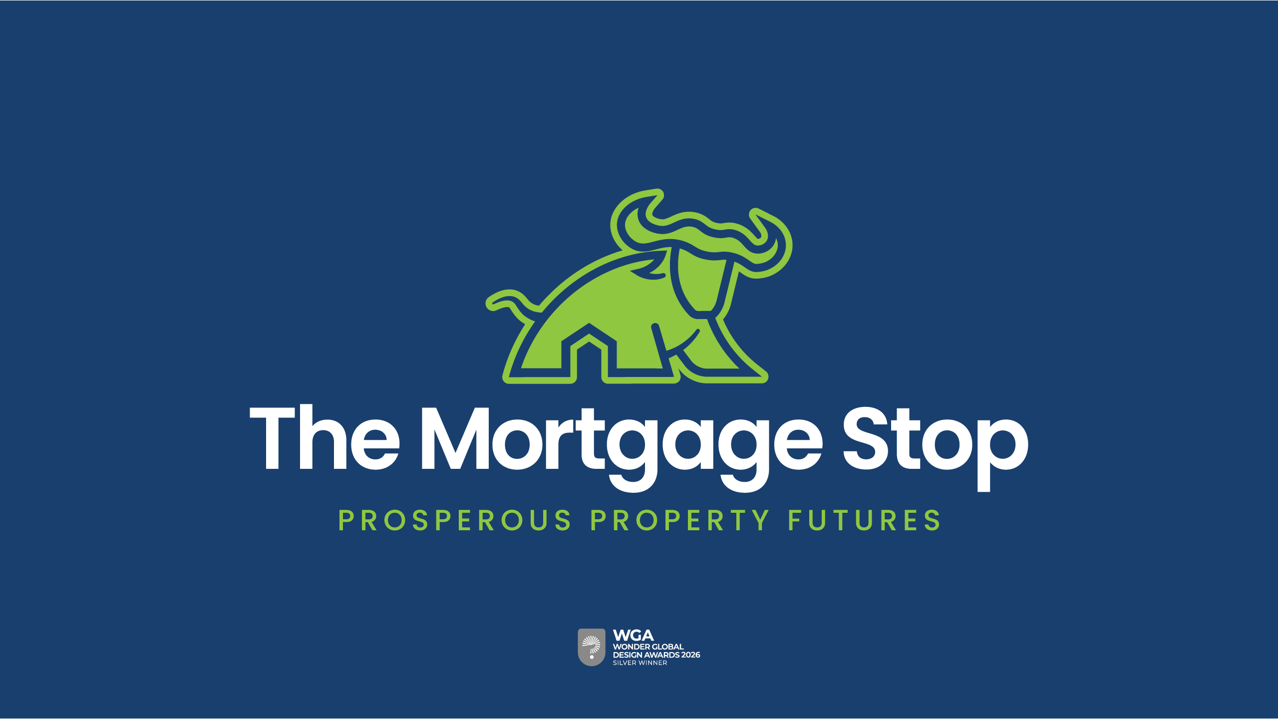
Every financial journey starts with a moment. Buying a home, growing a family, launching a business, or planning for the future. At The Kohli Group, we understand that behind every financial decision is a person, a family, and a future that matters.   The Mortgage Stop logo is designed to blend cultural meaning with clear, purposeful symbolism. The buffalo, a recognised Punjabi symbol of prosperity, represents strength, stability and hard work, reflecting the values that underpin both property ownership and long-term financial security. Within the form, the subtle inclusion of a house icon reinforces the focus on property, while the hidden “K” in the front legs connects the brand back to the Kohli family name, adding a personal and unified touch.   The clean line-drawn style keeps the mark modern and approachable, while the Poppins typography provides clarity and confidence. The bold brand name anchors the identity, with the strapline in a lighter weight reinforcing the forward-looking message of building prosperous property futures.

Why I wanted to help with this brand

This was an opportunity to do something really different in a sector where everything has become very similar and rather bland. There are so many house icon logos in this field and we wanted to stay well clear of falling into the same pot as the chasing pack! Now, we have a brand with a buffalo sat front and centre of the identity! The team at The Mortgage Stop really bought into the process and where happy to let the creativity lead the project. This project was a Silver Winner at the Wonder Global Design Awards, season 1, 2026.